You can extract values used in a plot with the
values_fig() function. Here we have a time trend plot from
keyATM Dynamic.
out <- keyATM(
  docs = keyATM_docs,
  no_keyword_topics = 3,
  keywords = keywords,
  model = "dynamic",
  model_settings = list(
    time_index = vars_period$Period,
    num_states = 5
  ),
  options = list(seed = 250, store_theta = TRUE, thinning = 5)
)
fig_timetrend <- plot_timetrend(out, time_index_label = vars$Year, xlab = "Year")
fig_timetrend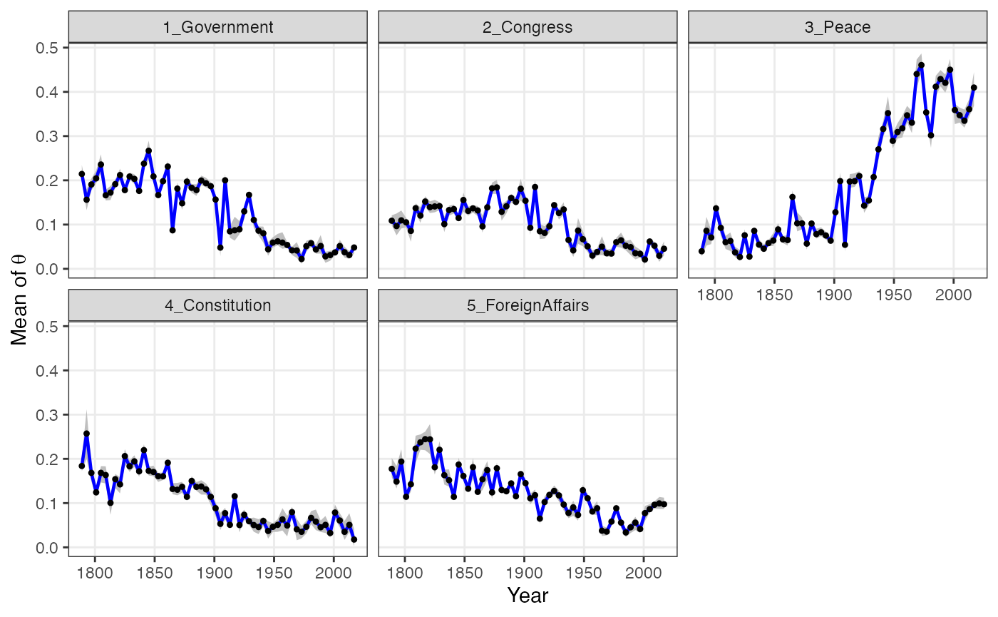
The values_fig() function returns a tibble used to
create the plot.
values_fig(fig_timetrend)## # A tibble: 290 × 7
## time_index Topic Lower Point Upper time_index_raw state_id
## <int> <chr> <dbl> <dbl> <dbl> <int> <dbl>
## 1 1789 1_Government 0.199 0.214 0.235 1 1
## 2 1789 2_Congress 0.0984 0.109 0.121 1 1
## 3 1789 3_Peace 0.0276 0.0397 0.0511 1 1
## 4 1789 4_Constitution 0.172 0.184 0.200 1 1
## 5 1789 5_ForeignAffairs 0.159 0.177 0.202 1 1
## 6 1793 1_Government 0.133 0.156 0.180 2 2
## 7 1793 2_Congress 0.0756 0.0966 0.125 2 2
## 8 1793 3_Peace 0.0526 0.0860 0.117 2 2
## 9 1793 4_Constitution 0.200 0.257 0.312 2 2
## 10 1793 5_ForeignAffairs 0.133 0.149 0.184 2 2
## # ℹ 280 more rowsWe can use it to customize the figure.
library(ggplot2)
values <- values_fig(fig_timetrend)

values %>%
  filter(Topic %in% c("1_Government", "3_Peace")) %>% # extract two topics
  filter(time_index >= 1900) %>% # from 1900
  ggplot(., aes(x = time_index, y = Point, group = Topic)) +
  geom_ribbon(aes(ymin = Lower, ymax = Upper), fill = "gray75") +
  geom_line(linewidth = 0.8, aes(colour = Topic)) +
  geom_point(shape = 5, size = 0.9) +
  xlab("Year") +
  ylab(expression(paste("Mean of ", theta))) +
  annotate("text", x = 2005, y = 0.12, label = "Government", colour = "#F8766D") +
  annotate("text", x = 2005, y = 0.28, label = "Peace", colour = "#00BFC4") +
  ggthemes::theme_economist_white(gray_bg = FALSE) +
  theme(legend.position = "none")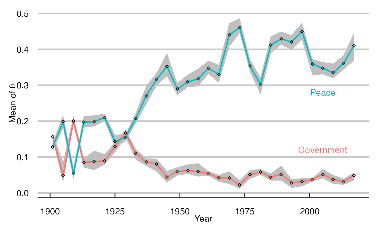
The values_fig() function works with other
keyATM plot functions. Check the reference for
details.